April felt like the perfect month to try out a new theme that I have never done before. I’ve been wanting to do a fairytale or royalty theme for a while and I finally got to it! The best part is that my April bullet journal set-up turned out pretty great. Check out how my fairytale royalty bullet journal theme turned out!
Supplies
- Tombow Dual Brush Pen, Warm Gray
- Tombow Fudenosuke Pens (Soft Tip)
- Crayola Super Tips Markers
- Tombow Dual Brush Bright Pens (055, 173)
- Tombow Dual Brush Tropical Pens (803, 817)
- Pigma Micron Fineliners (0.5, 0.2)
- Tombow Dual Brush Retro Pens (126)
- Tombow Dual Brush Pen (991)
- Tombow Dual Brush Pen (452)
Bullet Journal Cover Page
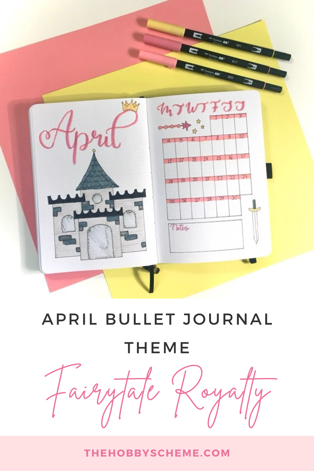
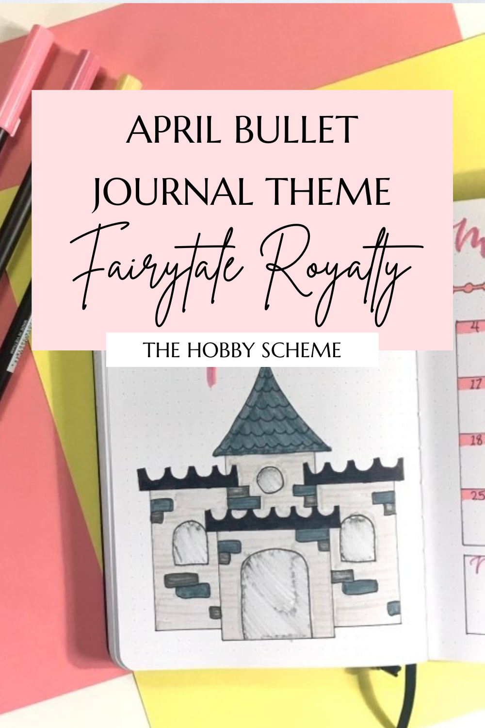
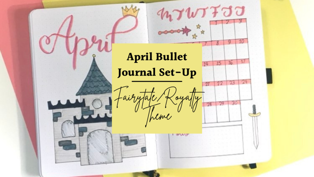
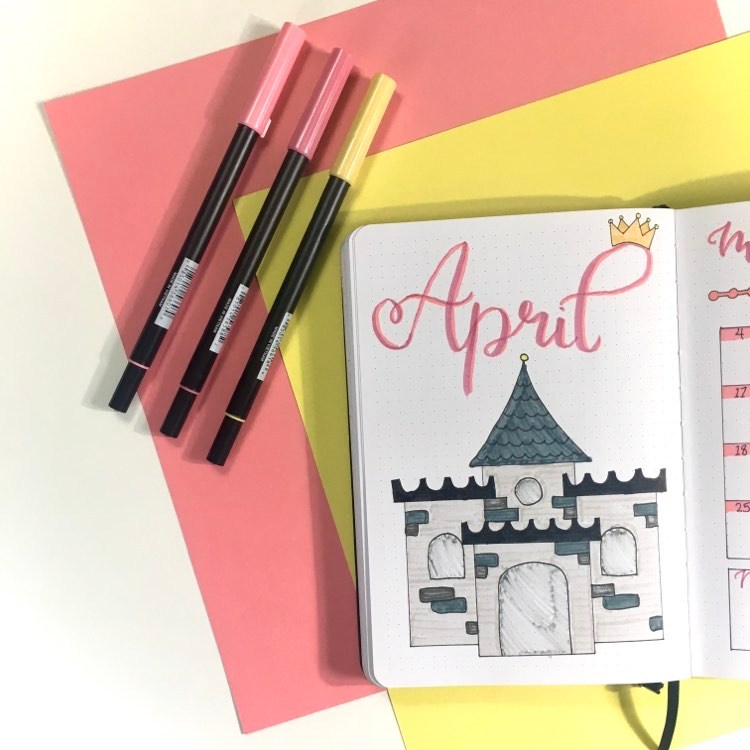
My cover page for my April bullet journal set-up is one of my favourites this month. To keep with the theme of royalty, I drew a castle at the bottom of the page with grey markers. The rest of the spreads have smaller doodles but for the first page, I wanted something spectacular.
The castle takes up most of the page but above that I have the month name in a pretty cursive that reminds me of royalty. The font is called Aniyah, which I found on Canva. (I use Canva all the time for stuff like this.)
I plan on using the pinks in the name in the next few spreads, so I thought adding the colour here would be a good way to introduce them.
Lastly, and my favourite part, I added a cute little crown above the L in April to give it more of that royalty/fairytale feel.
Here’s my April bullet journal cover page:
Calendar Spread
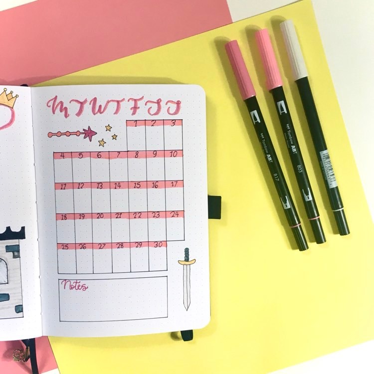
As usual, I kept my calendar spread pretty minimalistic. I prefer this spread to be as uncluttered as possible because I know I’ll be adding a lot of things to it later.
To add my theme to this spread, I was thinking of making it prince-themed. So I started with a little sword in the corner but my idea of a little froggy prince didn’t work for this page. I went with a little wand instead.
The wand is where the pinks from the cover page come in. The wand is in pink with little yellow stars coming out the end.
This calendar spread ended up being a royalty and fairytale tools-themed page.
Here’s how it turned out:
Daily Highlights Spread
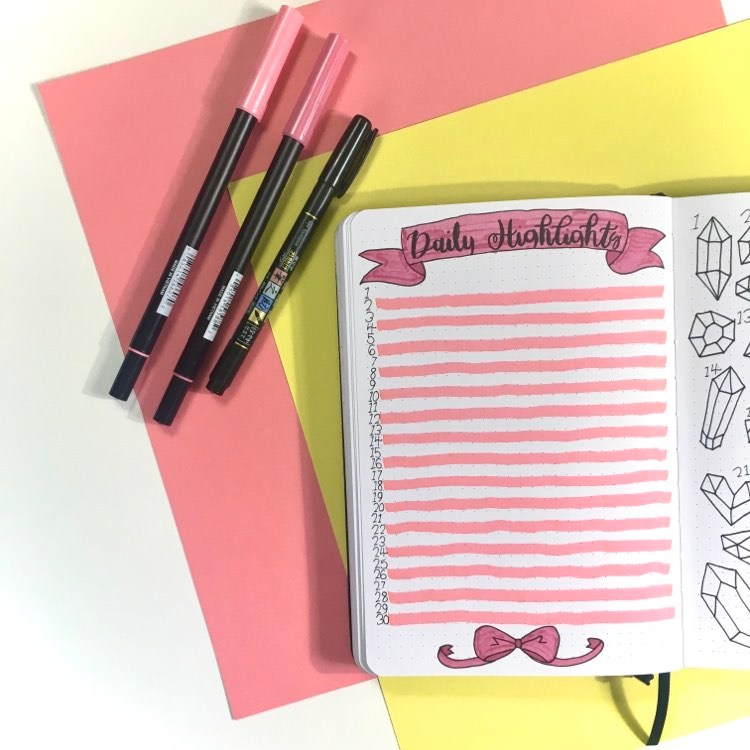
Because I have to write so much on this spread, I wanted to have an easier and smaller design. I decided to go with ribbons and banners. It reminds me of pretty dresses and the banners you might find hanging in a castle. Again, I used the pinks from the cover page to make the ribbons and banners. (See how that worked out! Colour-coordinating from the beginning!)
I used the same font from the first spread to write “Daily Highlights”. And I added lines for every other day to make it easier to separate my daily highlights.
It’s simple but cute. Here it is:
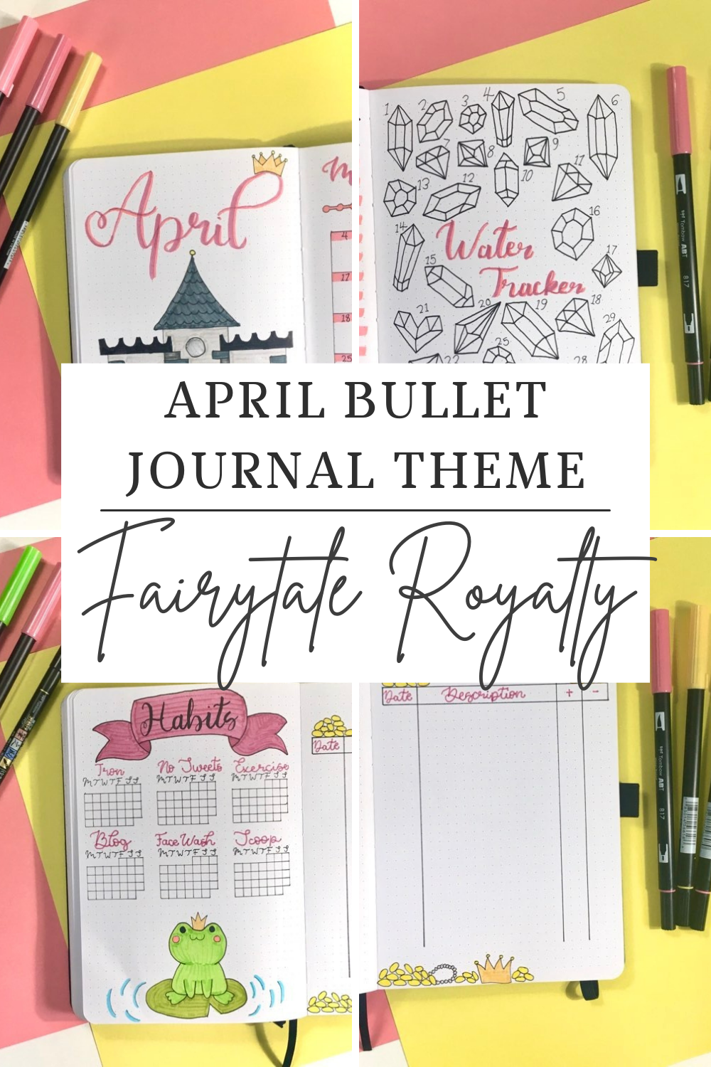
Water Tracker
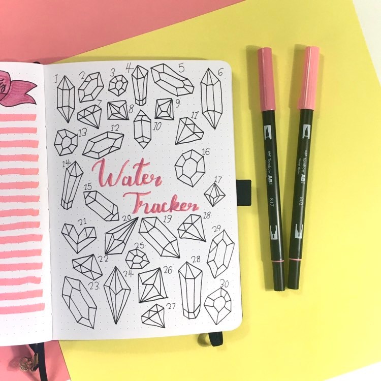
For my April bullet journal set-up, I was aiming for a royalty theme but I quickly ran out of ideas. My sister gave me the brilliant idea to use gems and diamonds this month. So I ran with it!
I have a gem with 8 or 9 pieces for each day of the month. So I just need to fill in the gems with the pinks from the previous spreads. If I drink 8 cups of water that day, I get to colour in the whole gem.
I love making fancy water trackers. This year, I decided to do a yearly mood tracker, so I don’t get to make those spreads anymore (even though they were one of my favourites). It feels good to create some water trackers that are a little more intricate to make up for my loss of mood trackers.
Here is my design for my April water tracker set-up:
Habit Tracker
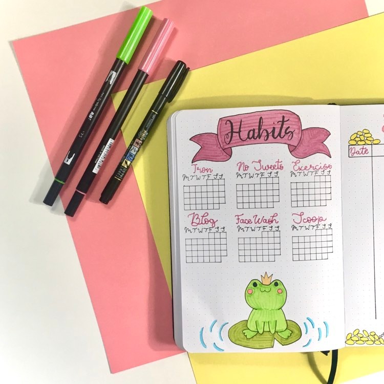
Here is where the froggy prince comes in! I added a cute little frog at the bottom of the page. I wanted to add him somewhere within my spreads for the month. (He is named Freddie!) He’s so cute! Freddie is sitting on a lilypad with waves around him.
Once I got to my habit tracker, I decided that the banner from the daily highlights spread was a little out of place. So I wanted to add it somewhere else too. My habit tracker needed something else to complete it. It worked out great!
This spread is probably my favourite one on the list! Here it is:
Budget Spread
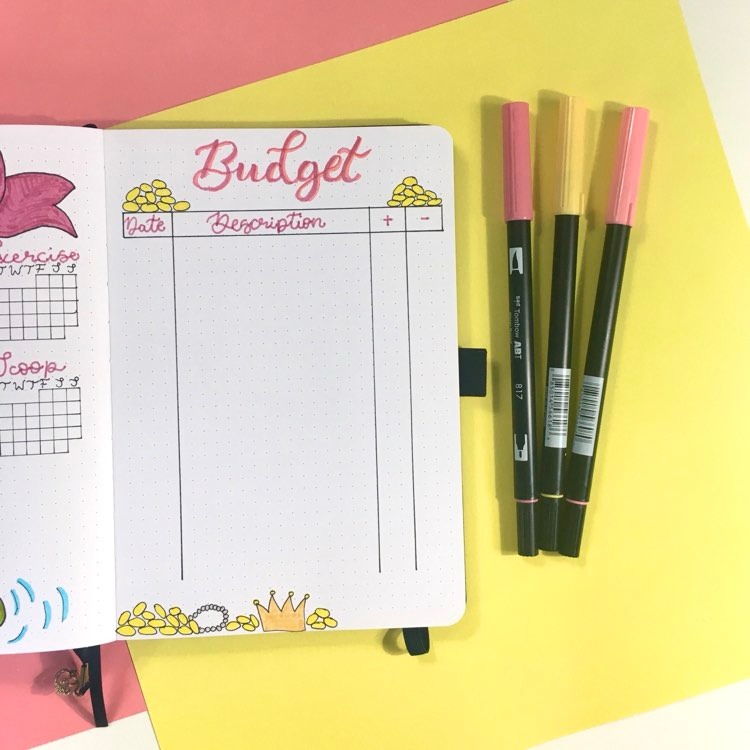
Usually, I choose a split design between my income and my expenses but I wanted to try something new. I have a list of everything together but I have a column for both income and expenses. It’s easy enough to add the amount of money I made or spent in their respective columns.
As always, I have a column for the date and the description of my earnings or purchases. It is simple but it works.
Next, I added some gold coins, crowns, and necklaces to the spread to involve my theme. At first, I considered having a dragon guarding the treasure but it ended up being a little too complicated for me. However, the treasure was still a cute idea so I kept it.
When spring comes along, I get the desire to use lots of bright colours. The best way to do that this month was to try a fairytale/ royalty theme. I just loved how it turned out! It’s super cutesy and made for the perfect theme for the month of April!
Related Articles
