Every month, I need to design a new bullet journal setup. I love being creative and coming up with something new each time! For this August bullet journal setup, I was aiming for a man vs nature theme.
I started with the idea of buildings covered in vines and leaves, but once I got started, the cityscape worked so well that I decided to leave it alone. So here’s what I came up with!
Monthly Spreads
There are a few spreads that I use every month to track things, such as my daily highlights and how much water I drank that day. This month I used a cityscape design to pull all of my spreads together. Check out my post on how to organize your month in bullet journaling to learn more about what spreads you might want to include in your bullet journal monthly.
Cover Page
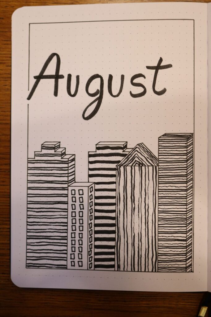
My cover page this month is pretty simple. I used lines and shadows to create the look of buildings coming up from the bottom of the page. The entire page is in black and white. The lack of colour gives it a nice classic look that works well with the cityscape theme. I used my Micron Pigma pens size 08 to draw the outlines of the buildings and the page border. The lines in the building as well as the writing were all made using a black Tombow Dual Brush pen. These tools were used in all the rest of the spreads this month.
Once I had the buildings in place, I distinguished them from each other with lines going across the buildings or by creating the illusion of windows on one of the shorter buildings. The goal was not to make the lines look perfect but to fill the space. I think the lines really bring the spread together.
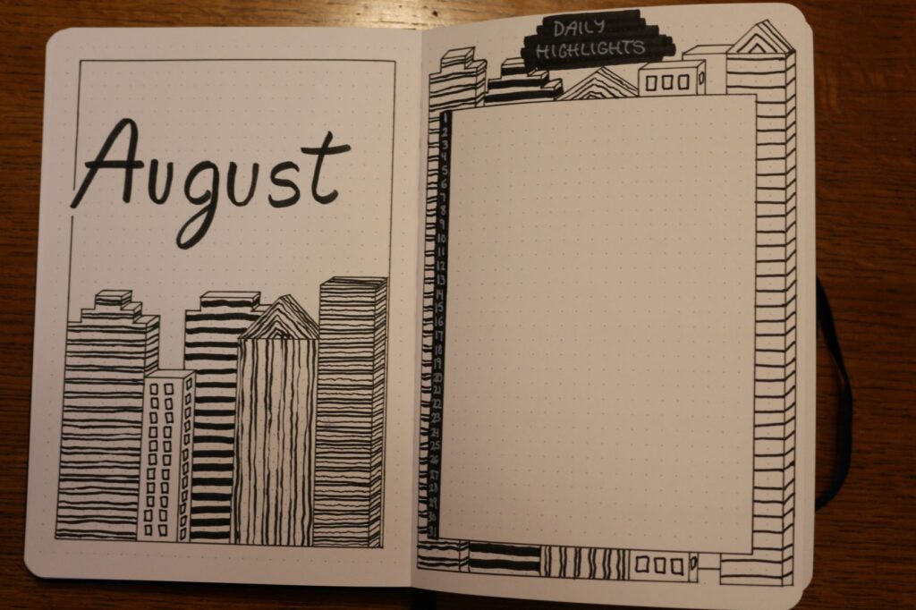
Daily Highlights
My daily highlights spread was also in black and white, which I used the same tools to accomplish. However, this time I decided to use my Sakura Gelly Roll pen (size 10 – Bold) to write the numbers and the title of the spread.
I gave myself lots of space in the middle of the page to write my highlights. And I went for a simple border with buildings around it. The buildings here were easy enough to make. I used the same designs from the cover page.

Calendar
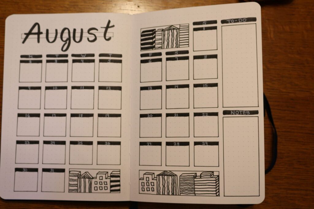
For the calendar this month, I used a full two-page spread. I felt like I needed a little more room than usual. (Typically, I use only one page. You can read more about that in my monthly organization post.) I also added a to-do list and notes sections to help keep me organized with everything I wanted to accomplish this month.
For the design, I went simple. The lines were kept in black and white. I used a black background for all of the writing and used a white pen for writing. To keep this spread within this month’s theme, I used the larger gaps of space and filled them with little doodles of buildings. They do not take up too much room, so the design still looks fairly clean and simple.
Water/Step Tracker
For my water tracker, I like to have 8 spots that I can fill in to represent 8 cups of water a day. This month I decided to incorporate it as windows in a building. The building has 31 “floors” (for the number of days) and 8 windows for each floor. I think it turned out pretty good. The window squares are not perfect, but they will do for what I need.
When tracking my steps, I like to know how many steps I have actually taken each day. Therefore, I went for another building but each “floor” is a space in which I can write in the steps I have taken that day.

The design of this spread is nothing fancy, but I still think it is pretty cute.
Habit Tracker
This month’s habit tracker is one of my favourite spreads for the month. I put my habits into three columns, each becoming its own building. The amount of hobbies in each column varies to make it look better. The buildings were then given a black shadow. I loved how the shadows turned out! It really makes the design pop.
For each hobby, I wrote out the days of the month, like a mini calendar. For each of them, I have a little black line so that I can write out the hobbies I am tracking this month in white pen.
The title is sideways because I messed up a little bit. I did not put it into consideration while making the buildings, but I still think it looks nice on the side like that.

Weekly Spread
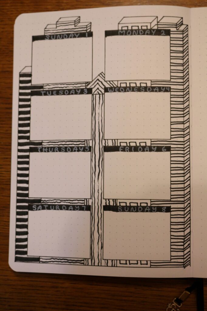
For my weekly spread, I tried going for a similar design as the Daily Highlights spread. I have a box designated for each day and buildings in the background.
This design was not as successful. The buildings just make the page a little hard to concentrate on. If you wanted to replicate this spread, I would suggest joining the boxes and having the buildings around the edges of the page.
Thanks for planning with me this month! I hope to plan with you in the future!

