Every bullet journal comes out a little different because we all have our own styles. However, there are a few common aesthetics that you might want to know about before starting your own bullet journal.
The different styles and designs for bullet journals include minimalist, vintage, simple, artsy, and soft/cute. Everyone has different organizational needs and design preferences; therefore, we all have different aesthetics for our bullet journals to keep us motivated.
Minimalist
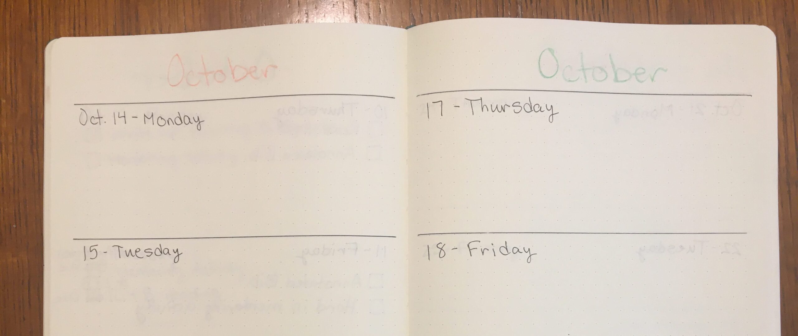
The minimalist aesthetic for bullet journals is the original design. When bullet journaling was first introduced, the spreads were simple. They were intended for organization and efficiency purposes alone. Minimalist bullet journals are typically black and white with very few additional (and unnecessary) details, such as doodles. If you are looking for a journal simply to help organize your life, you might be better off with a minimalist aesthetic. The minimalist aesthetic is still pleasing to the eye. It just has less detail compared to other designs. This style might also be for you if you are not into or great at doodling and art. (Keep in mind the picture below was made around the time I first started bullet journaling a couple of years ago.)
Vintage
The vintage style is really beautiful, but not for everyone. This aesthetic involves lots of different cutouts. What I mean by that is the design typically includes pictures glued into the journal or different sheets of paper used as a design element. Craft paper, a brown paper that looks similar to cardboard without the thickness, is a common find in this vintage aesthetic. You might also see newspaper prints of old letters glued into the bullet journal. For written things, calligraphy is usually seen in this style. There are also lots of great washi tapes out there with cursive, old map designs, and more that are great for the vintage look. The vintage design requires lots of embellishments that you obtain over time. Therefore, the vintage aesthetic might not be as easy for a beginner bullet journaler.
Simple
The simple design borders on the minimalist aesthetics with a little more colour. Some little designs might be included, such as simple shapes as design elements. For instance, your theme might be golden circles and blue rectangles. Unlike the other aesthetics, the art and doodles are not intended to be extravagant. You might simply want a little bit of colour to make the journal more your own. Note that your bullet journal can be as detailed or as simple as you want it to be.
Artsy
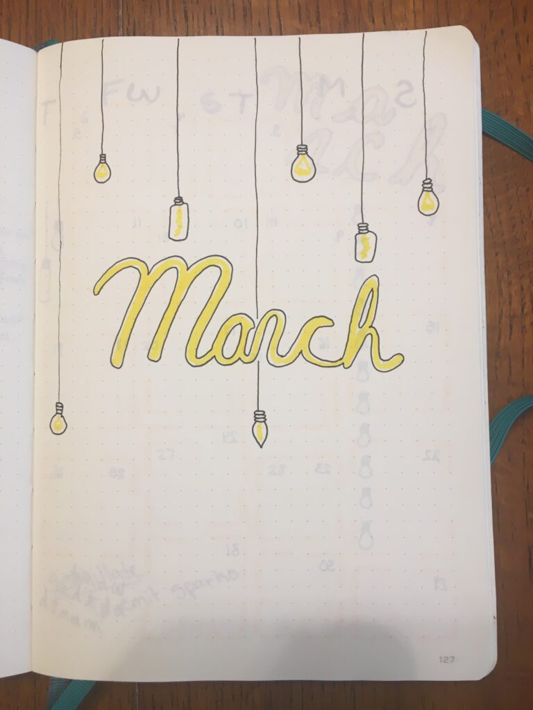
Some bullet journalers are likely to fill their pages with art instead of organization tools. The artsy aesthetic is basically like having an art journal where you also write down your to-do lists. Lots of people use watercolours and other paints in their journals. However, a lot of bullet journals do not have the proper page thickness for painting, so you may need to paint on watercolour paper then glue it into the journal. There are lots of beautiful designs for a bullet journal when you have the time and effort to put into it.
Soft/Cute
The soft/cute look is probably one of the most common aesthetics for bullet journals. My current journal falls under this category. AmandaRachLee, one of the most well-known bullet journalers, uses a cute aesthetic for her bullet journals. You should go check her out for inspiration if this is your style of choice. The cute aesthetic typically involves little doodles and lots of colours. Of course, what is deemed cute is different for everyone. The soft/cute aesthetic can vary between people, but you will find that lots of bullet journalers choose this approach for their journals.
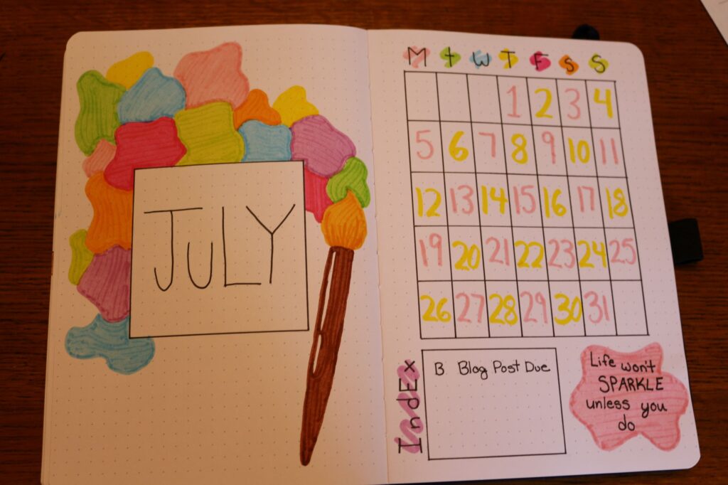
We are all different, so do not feel pressured to copy everything that you find for your bullet journaling aesthetic. The bullet journaling process should be a fun way to express yourself and cater to your own needs. Yet, it is always easier to start with an idea for a design in mind. Now that you know how you want to design your bullet journal, you can start creating your spreads. Go check out my previous article for some help with your monthly spreads!


